
UCLA SAIT Footer + Navigation Case Study
Role: UX Designer (solo project)
Duration: January - March 2021
Methods: website audits, competitive analysis, user profile, user interviews, usability testing, wireframing
slide deck available upon request
knowing where to go
With over 65 different student affairs websites – in addition to countless other UCLA-affiliated websites – it can be difficult for incoming and returning students alike to search for the resources they need to thrive during a hybrid school year.
The team wanted to analyze the value of a particular, often overlooked component: the footer. In our preliminary discussions, three key ideas arose.
1. Footer as a place of navigation 🗺
︎︎︎ Do people navigate using footers?
2. Footer as a place for additional information 📚
︎︎︎ Do people expect to find meaningful, related content in footers?
3. Footer as a “junkyard” 🗑
︎︎︎ Do people view footers as useful?
insights from research
what is a footer?
I wanted to start from zero because although I may have ideas of what a footer is, what is a footer supposed to be like and how do others perceive footers?
Readings published by UX agencies often frame footers as a second chance or as a last resort. If the body content wasn’t enough, people sought out the footer to redirect them to where they should go. Whether this is true or not will be seen in user interviews and testing.
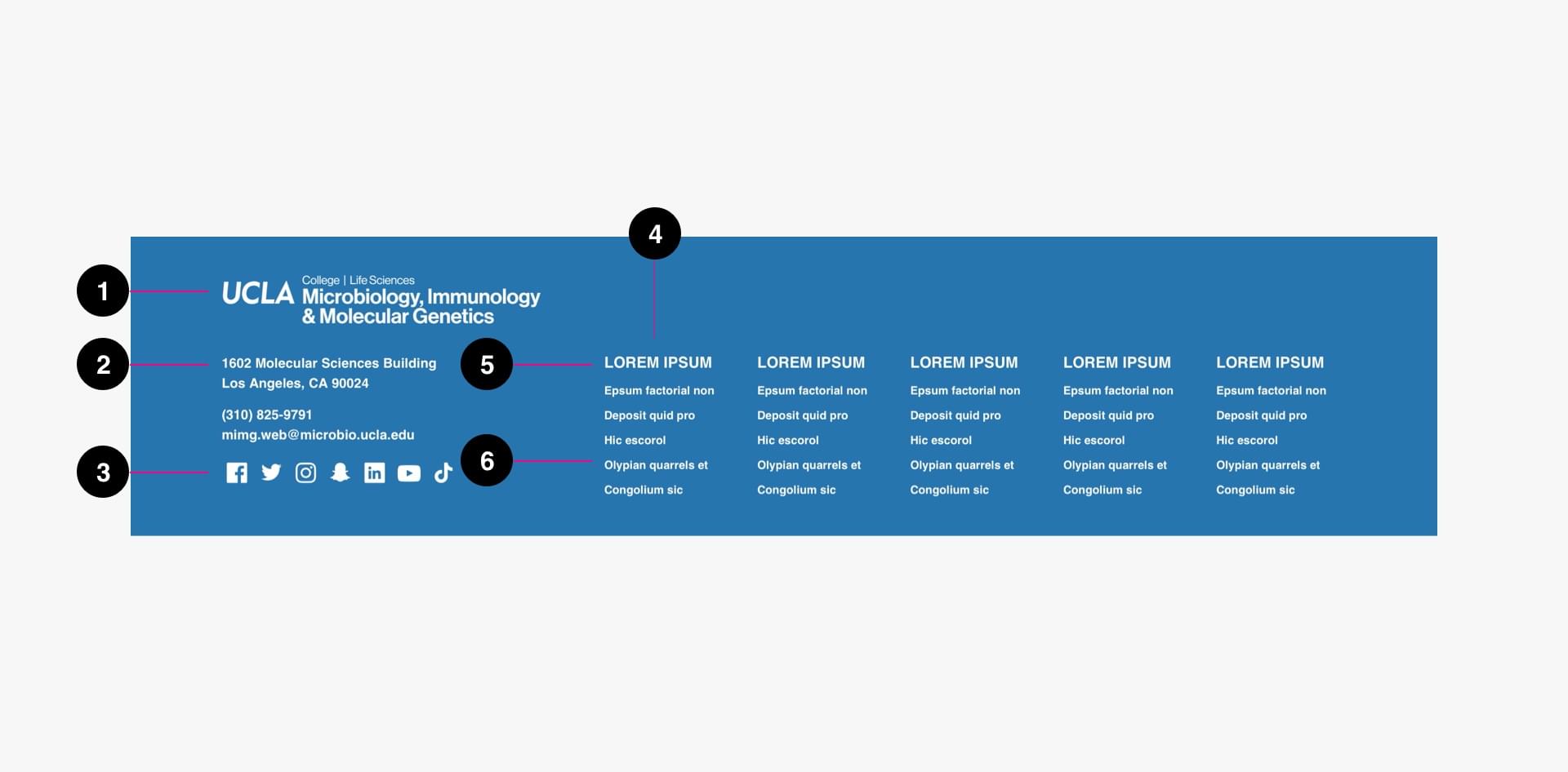
Footers will typically contain:

- Navigation
- Secondary links
- Utility links / Contact information
- Copyright / Privacy / Terms of Service
The Airbnb footer was the example I referred to while trying to figure out what a footer was. In this, I saw the importance of having consistent navigation content between all other site menus and the footer, but also allowing for flexibility in displaying relevant, secondary links somewhere noticeable.
UCLA also has new working guidelines for footer content, which were referenced throughout this project:
- Department Logo (required)
- Department Contact Information (required)
- Department Social Channels (optional)
- Department Links (optional)
- Department Link Heading (optional)
- Department Link (optional)
competitive analysis + feature analysis
Five California universities (including UCLA) were chosen based on proximity, while five additional universities were chosen based on the US News & World Report 2021 Best National Universities Ranking.
These are all websites that garner high amounts of traffic and have more of an incentive to maintaining quality navigation experiences.
For in-depth notes on every university websites’ footers, the competitive analysis is available on Google Sheets.

Even within UCLA alone, each website took a different approach to footer content. Although visually dissimilar, I deconstructed every footer to its core content to identify what remained constant and necessary:
• Navigation (often categorized by usage)
• Utility links (calls to action)
• Contact information (address, social medias, etc.)
These particular elements would later be emphasized in future dialogues regarding footer navigation. All other elements
user interviews
Although our websites are used by students, family, and faculty alike, I wanted to focus on the student experience. I reached out to current undergraduate students and listened to their thoughts on the dissemination of campus news and information across digital platforms during this remote-era of learning.
Here’s a look at our average users:
job: full-time college student (1 - 4+ years)
education: high school, some college (bachelor's degree)
technology usage: daily; laptop / computer + stable internet connection
housing: family home or off-campus apartments
These students specifically go to our websites when they need to find reliable answers to their current situation. Although users also reported going to social media platforms such as Facebook and Reddit, ultimately no source was as credible as an official UCLA-run website.
Consequently, there are three main implications resulting from this discovery.
- Efficient and descriptive navigation is crucial for information parsing.
- Users don’t aim to browse for long (time is precious!).
- If answers can’t immediately be found, providing contact information of those who can answer those questions are necessary.
usability testing
Students were asked to navigate through the UCLA Financial Aid website and the Student Affairs Guidebook pages.
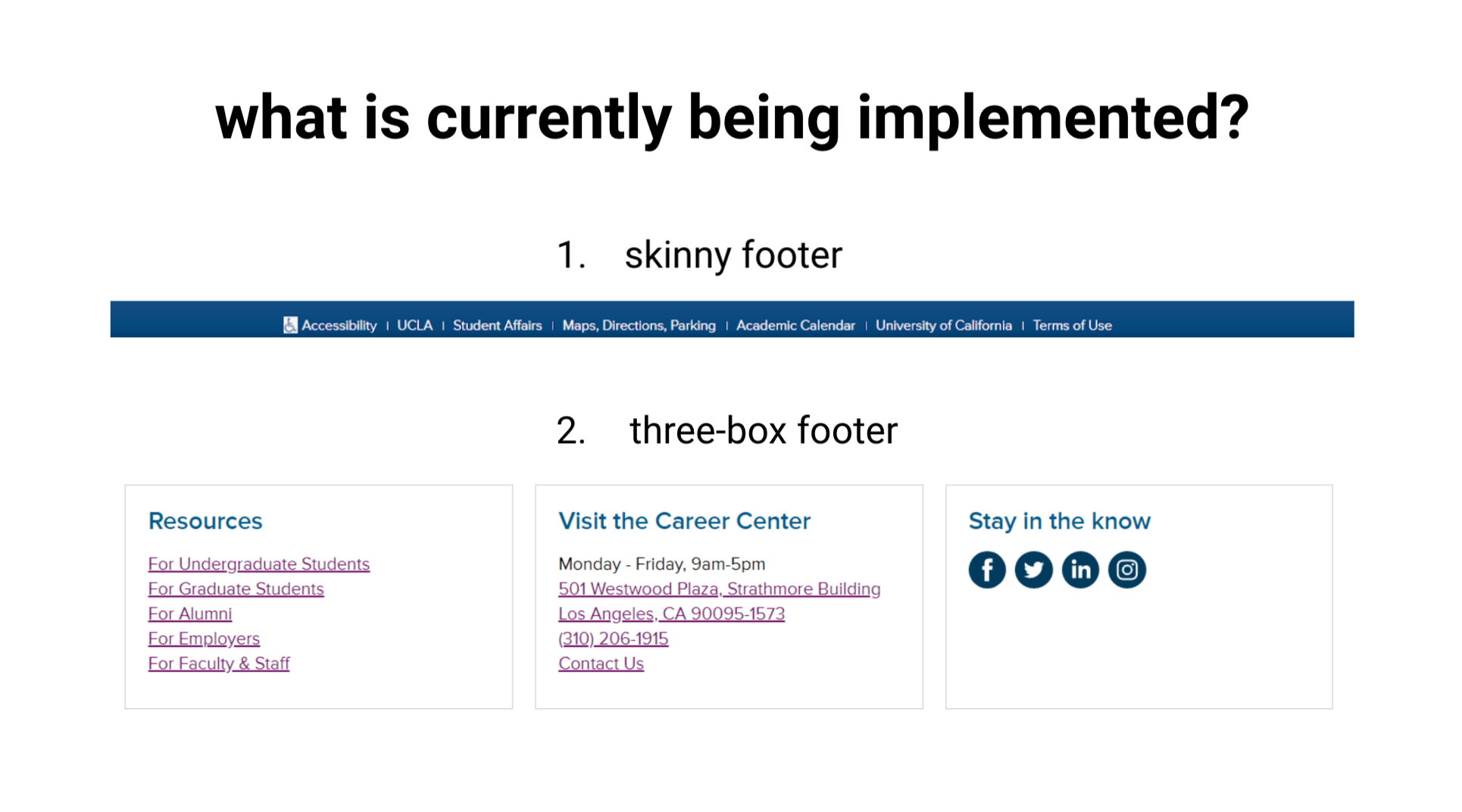
The key difference was that the Financial Aid site had no site-specific footer (skinny footer only) while the Guidebook pages did (skinny footer + three-box footer).
Financial Aid and Scholarships user insights

1. People were unsure if page content varied depending on which main menu option they used to navigate with
In the current site architecture, overlapping pages were bound to exist since many topics would be relevant to prospective, undergraduate, and even graduate students. At a glance, it was difficult for most to tell whether the page content was different depending on which main menu option they used, which made them worry about whether they were missing out on information if they had not looked into all options.

2. People were unsure if the side menu was supposed to mirror the main drop-down menu
Upon finding out afterward that both menus were supposed to be the same, users commented they found it redundant to have an additional navigation menu when they are already using the drop-down menu. The implementation of this side nav bar is also inconsistent across many other SAIT websites, which may lead to further confusion about its usage.

3. Not having a footer did not violate expectations if main menu and side menu navigation was straightforward to use
This was perhaps the most surprising finding from usability testing, since this project began with the purpose of discovering the usage of footers. From this finding, as well as further testing, I began to realize how navigation menus work in tandem to create a fluid navigation experience. It shaped how I advised departments on the content that should be included in all navigation menus, not just the footer.

- users look for key navigation elements in the following order: top, side, and bottom
- users were able to navigate to target pages with relative ease, even without a footer
- conversations were centered on other navigation menus (main nav, drop-down)
- the lack of a site navigation-centric footer went unnoticed
Student Affairs Guidebook user insights

1. People typically did not scroll all the way down to the footer if the page has a substantial amount of content to scroll through
People do not usually go out of their way to find the footer, which ties back into the finding that all navigation menus work as a unit. Important, relevant content should be evident in the main menu or page content before appearing in the footer.

2. Users did not immediately recognize the three-box footer as a “footer,” but rather as cards
Diving a bit into visual language, avid users of technology often instinctively associate boxes with cards. Although not too major of an issue in terms of usability, it was interesting to test the limits on what counts as a footer. The three-box footer was a component we recently introduced without much testing beforehand, so it was great to get feedback on the designs. Moving forward, site footers will look like the standard footer that people are familiar with.
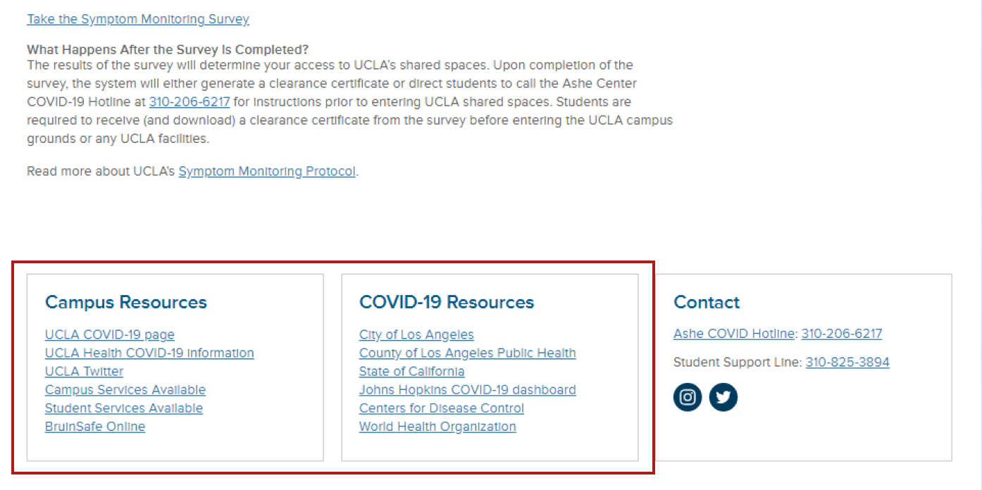
3. People were confused about why additional content links were added to the footer rather than as page content
When people look for additional resources, they tend to expect a list of recommendations, such as a page with cards or buttons. As previously mentioned, footers tend to be the last thing people encounter if at all, which makes these helpful links unnoticeable. Often times, footers suffer from containing a laundry list of links that are included for the sake of being included. We should be asking departments: what value do these links bring to the people using your website? And if they are truly useful, they should be easy to find.

- users could still navigate without main nav through internal pages via cards, target navs, and breadcrumbs
- users were able to navigate to target pages with relative ease
- conversations were centered around the footer and whether it violated their expectations of what a footer should look like and what it should contain
closing thoughts
People did not usually notice whether a footer was present as long as all other navigation menus met their expectations. As such, the reception of the footer had been contingent on the quality of the overall site navigation experience moreso than I had anticipated. If I could approach this project differently, I would want to place more emphasis to researching people’s behaviors toward main menus and drop-down menus as well.
proposals

- Contact information (e.g. physical location address, phone number, etc.)
- Social media links
- Navigation links
- Legal terms (e.g. privacy and terms of use, accessibility, etc.)
Keeping in mind the overlapping elements of the footers I looked at and the content that my participants mentioned, I designed a footer that would concisely contain the content that users would expect to see while following conventional component designs.
Following UCLA’s branding guidelines, my mockups involved adapting the template footer I created into a footer that fit the needs of its department. The footer content remains the same in designs, but much work needs to be done to revise the footer content based on the feedback I received in mind.

In terms of revising footer content, I communicated the importance of collaborating with departments on maintaining and updating our current site navigation menus. As of these findings, the team has now adopted a model where all navigation changes must be communicated by the department to an SAIT UX team member for further review.
conclusion ︎
Although often overlooked, when a navigation menu is not what someone expects, it can still affect how easily they can find what they’re looking for and how likely they are to come back.
This project, which began as a study on footers, resulted in an overhaul of our prior assumptions about header menus, sidebar menus, footers, and how they all interact with each other to create a cohesive experience.
The SAIT team is continuing to work with departments on bettering the navigation experience for students, family, and faculty alike. From this project, I learned a lot about designing for web accessibility and incorporating user feedback in meaningful ways outside of designing screens.